
I painted using pictures.
School has started! Which means I can get back to work. 🙃 So here we go.
I was introduced to Photoshop about 20 years ago. After some intense battles we agreed to never speak again. I broke that agreement when I took my first photography class at Glassell and dove head first back into it. Are we friends? NO! Am I trying? YES! I had had idea of using my photographs for color blocking a while back but never did anything with it. Bring on the Furry Little Peach #DIYS challenge. I love her and her work so I knew I had to participate. The original illustration was very blocky (is that a word? 🤷🏾♀️🙃) so I knew it was meant to be. I have A LOT of beach photographs so it was a no brainer. I use them to practice so I had plenty to choose from.

My take on the DRAW THIS IN YOUR STYLE ⚘
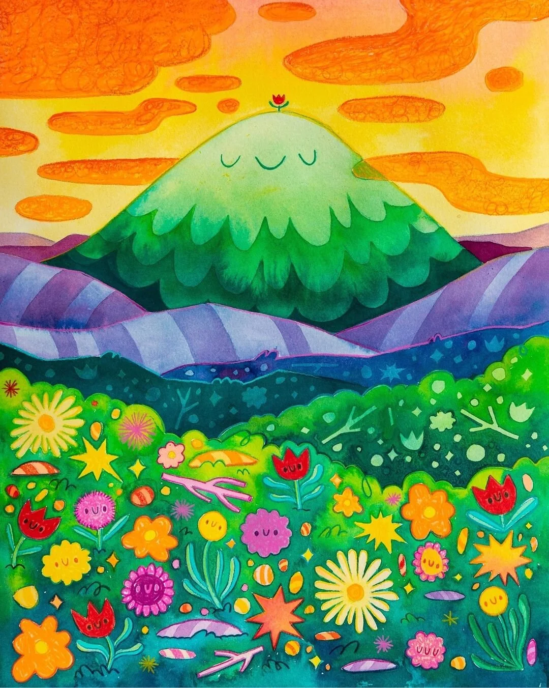
Original illustration by Sha’an d’Anthes better known as Furry Little Peach. https://www.instagram.com/furrylittlepeach/
My first instinct was to make a beach scene of sorts. Far away sky for the background, mid tones for the mountains and light for the foreground. Here is my process.
I started by layer masking all the blocks in the original picture. I ended up with a ton of layers. It took forever and a day but was amazing layer masking practice. Everything had its own layer except for the flowers and shapes in the bushes which each had their own layer.
For the sky I chose a photograph that had a lot of depth.
I made the maintains different shades of green. I used the same photograph in the different angles and scale to show different colors and give dimension.
The foreground is one close up photograph of sand. I left the flowers in top because I felt like it would bring back Sha’an’s style which I love.
As I added layers I moved back and forth to Procreate and messed by adding lines to the borders between blocks. I went back and forth between colors and thickness of lines.
I decided to make the main mountain shades of blue. Again using the same photograph with different angles and scale.
I played a little more with the lines settling on colors. I outlined all the flowers individually and added a few details.


After all this I decided I didn’t love the finish result. So I started over this time trying to follow the shapes and colors of the original picture. I learned a lot from the first try so this took a lot less time. I did it a lot more smoothly which means I don’t have that much documentation of the process. Crazy enough I used the same photographs just in different ways.
I used a much brighter sky this time because I wanted to mimic the fiery orange from the original.
For the mountains in the middle I turned the waves on their side to mimic the stripes in the original mountains.
The bushes in the middle and foreground I mimic the color of the original and I created a mask with the shapes and kept those intact.
In Procreate I once more added lines to separate the blocks of color. This time I went back to the original picture and grabbed the colors Sha’an used in the original painting.
I also outlined the flowers and shapes with colors from the original illustration.


I am so happy with the way it turned out. I am especially super impressed with all I learned from Procreate and Photoshop and how well they work together. I will be trying other challenges in the future.